Empowering a New Look: Reach Out To Asia Revamps Its Logo
• New identity ‘fresh and simplified’
• New website also launched
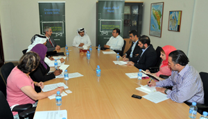 In a media roundtable today, Reach Out To Asia (ROTA) revealed its new identity to the public, showing off a fresh and simplistic approach to its logo. In addition, the organization’s website also received an overhaul, offering a more modern and user-friendly communication option with all stakeholders of the organization. The changes were approved by the Reach Out To Asia Board of Directors on October 25th, 2011.
“Reach Out To Asia first launched its activities in 2005, explained Mr. Essa Al Mannai, ROTA Director. “Even though our mission has remained the same, we have diversified our portfolio to include more activities and programs. After six years, we believed that the time was ripe for a new look.”
To those familiar with the original ROTA logo, the new one offers a simpler and straight forward retake. The icons above the logotype were re-illustrated, clearly differentiating the pre-existing components. From left to right, the icons represent money, education, a safe environment, and children, with the sun representing hope and happiness. The logo still exhibits an equation; however, the house icon and wheat symbol were combined to form one cohesive unit.
“Originally, the house represented a safe and secure infrastructure, with the wheat representing the environment,” explained Mr. Al Mannai. “Although tackling environmental issues is crucial to make our world better place, ROTA’s central focus has been on education. Therefore, by combining both the house and wheat icons, this specific part can be reinterpreted as meaning a ‘safe and secure environment’ – a precursor to any successful education and development program.”
In addition to the icons, a new font was used for the logotype, exhibiting smoother letters and a bold look. The green and maroon colors have remained unchanged.
“Our identity hasn’t changed per say; just evolved,” continued Mr. Al Mannai.
Prior to the revealing of the new logo, a creative teaser campaign hit the newspapers two days before the launching, building excitement in the Qatar Foundation community and elsewhere.
“A new brand identity is a very important move for a corporation or an organization,” said Mr. Shady El Mansoury, ROTA’s Marketing and Communications Manager. “A logo represents everything an organization stands for, and this change was very exciting for us. We created press ads to ‘tease’ the public prior to the launch, and allowed the readers to interact directly with the advert through a QR code which directed them to a website. This made success measurable, and I am pleased to announce that based on the hits on the QR code website, it was a highly successful campaign.”
Reach Out To Asia’s website was also redone. The website is now heavily image-based, taking advantage of ROTA’s huge photograph database. The new look is modern and simple at the same time, and clearly directing users to the information they are seeking.
“The old website was essentially text-based,” said Mr. Pascal Siegel, Online Education Manager. “Our team studied ways to make it more user-friendly, and at the same time, be able to exhibit the work that we have done all over Asia and Qatar in an attractive and practical platform. We also wanted the website to be flexible, easily allowing amendments and additions in the future. The final result is more in tune with similar non-governmental organizations worldwide, and we are very proud of the outcome.”
To view the new Brand Identity and the new website, please visit www.reachouttoasia.org.


